Nokia Lumia 630 Review Part 1
/It's bye bye Motorola Moto G and adios Android for a little while. Today I am starting my 3 week Windows Phone 8.1 experiment, and to begin with I have received today the Nokia Lumia 630 (first Windows Phone with WP 8.1).
This first part will be about the phone, my first impressions on how it behaves and on Windows Phone 8.1. Next week I will be able to write a more detailed post about my full experience with the Lumia 630, and on week 3 it will be my final thoughts about it, and I will answer the most important question of all: Is Windows Phone 8.1 for me and should I keep the Lumia 630?
Are you ready to follow me on this journey from one of the most popular mobile OS (Android) to one of the most refreshing (visually) OS: Windows Phone 8.1? Let's start the review!
Nokia Lumia 630: What's in the box?
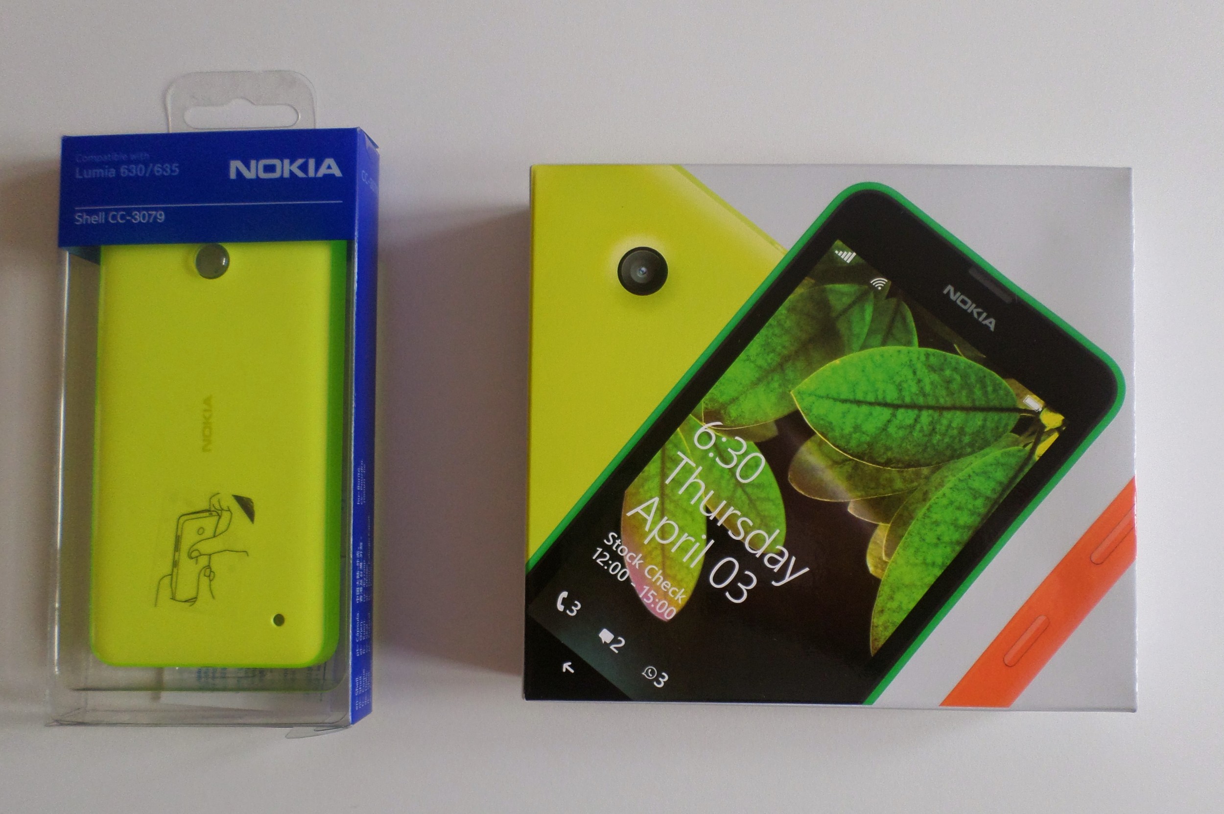
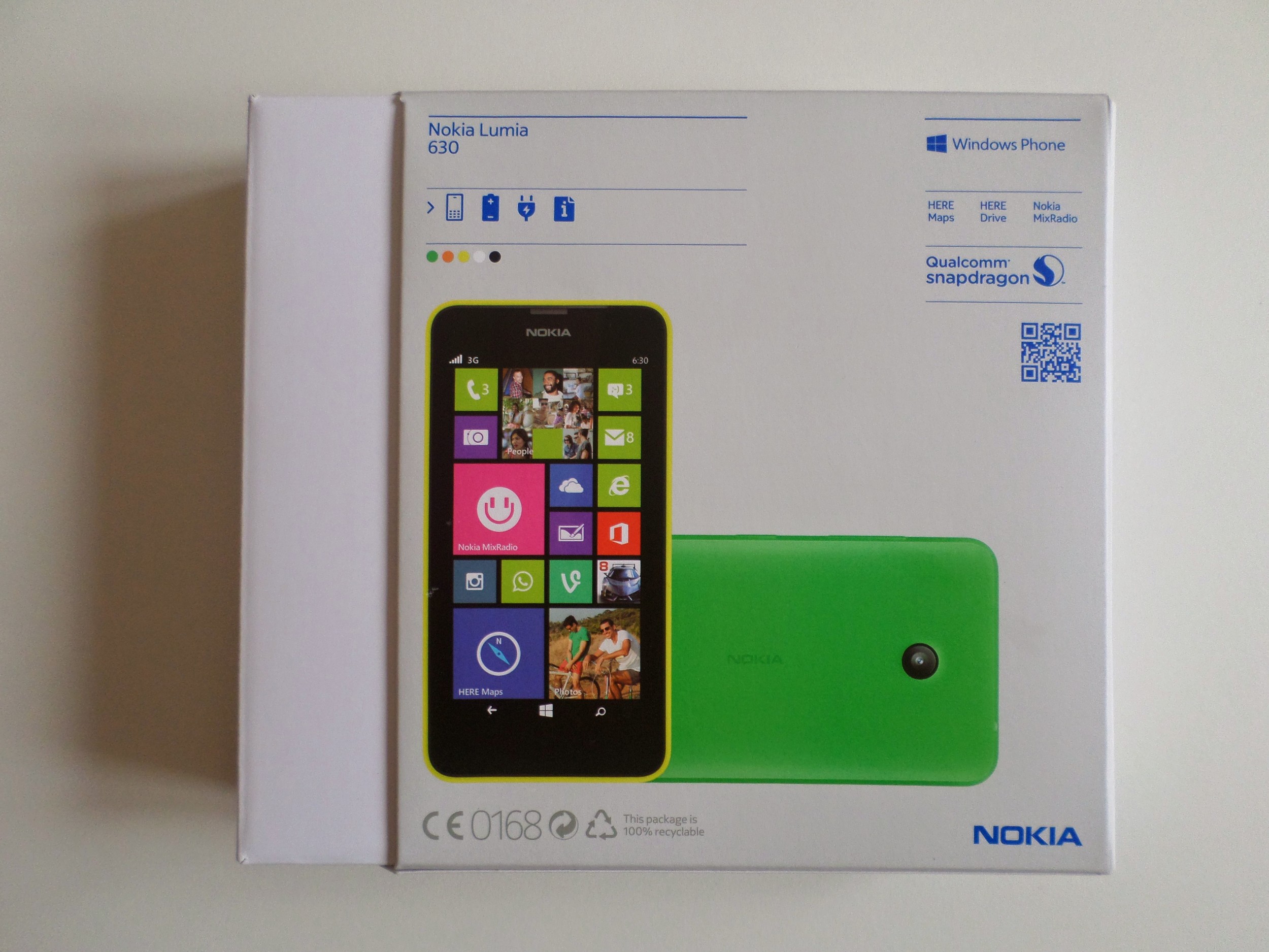
The new packaging of the Nokia is a nice welcome change. Bye bye to the big blue box, it's time to say hello to a nice slim white packaging. So what do you get in the box: a black charger, the Lumia 630, the battery, and some leaflets for a quick start. The new packaging is much nicer and I hope Microsoft will keep it that way.
Nokia Lumia 630: First impressions
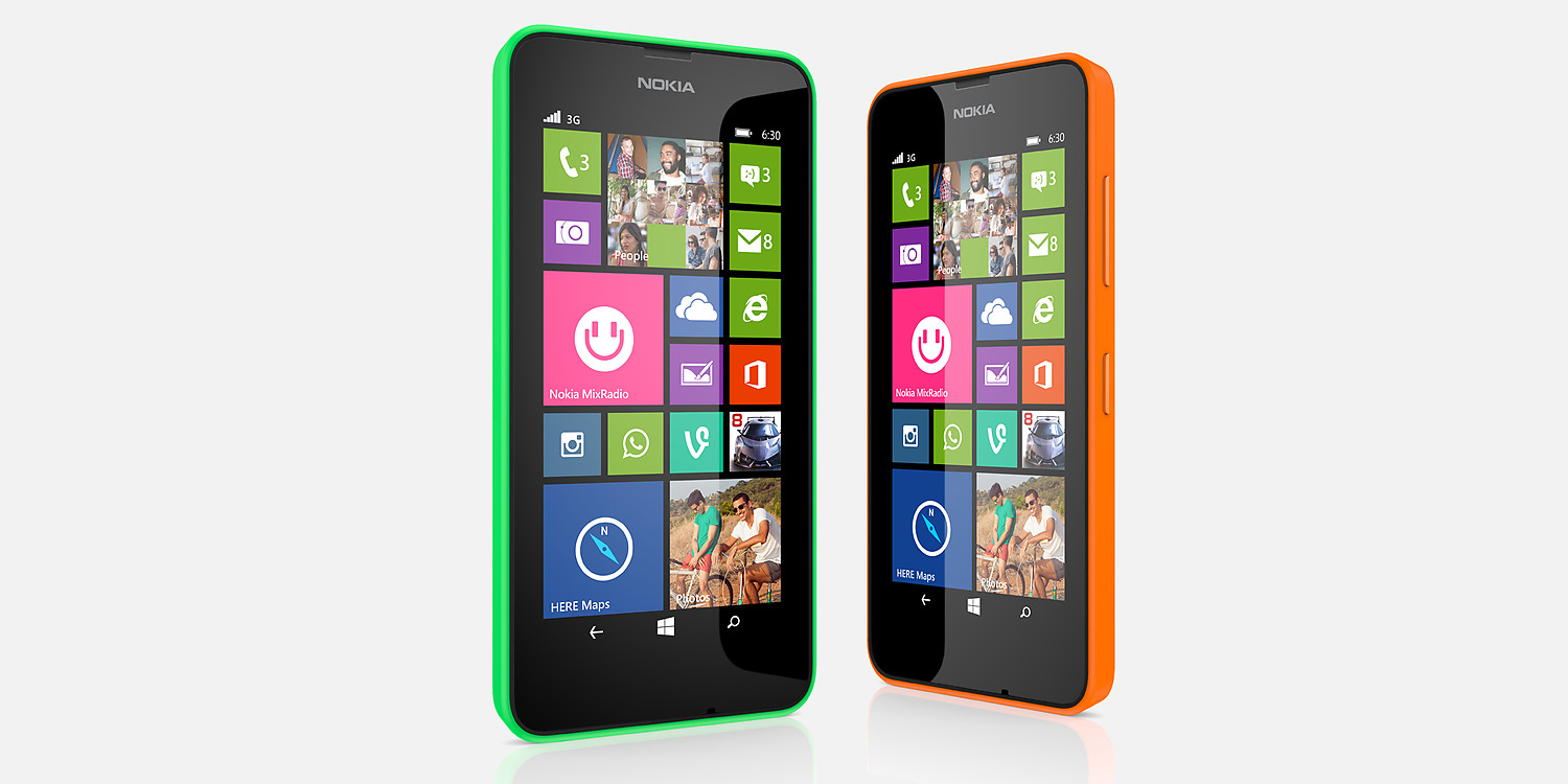
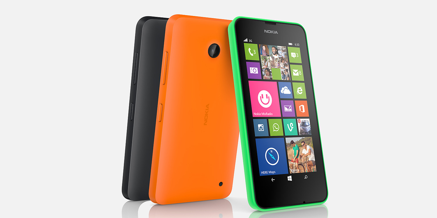
The Nokia Lumia 630 is a small smartphone by today's standard (4.5" is tiny comparing to the Note 3). The Nokia Lumia 630 is made of plastic but it feels very well built. The Nokia Lumia 630 is a budget phone but comparing it with some Samsung phones...it feels like a premium device. It is a slim device of 9.2mm and it weighs only 134g. My Nokia Lumia 630 is the orange one, but I changed the back cover and chose the bright yellow Nokia CC-3079 cover. The yellow is really bright, but this is a Nokia phone, so it has to be colourful! My first impression is highly positive on the build side. My previous phone was a Moto G and I think the Lumia 630 feels better in the hand. Last year I used the Lumia 820 for few months and I think the Lumia 630 looks nicer and is definitely less bulky.
Display, speaker and the battery:
In an era of full HD smartphones, launching a mobile with only a 854 x 480 resolution (pixel density 221 ppi) can be a risky move from Nokia. However, the screen is surprisingly bright thanks to an IPS display and Clear Black technology. It doesn't look washed out like the previous Lumia 520, and colours looks great. Of course with only a 221 ppi you will notice some pixels, but this is a budget phone that costs less than £115. Phones are getting bigger and bigger with average of 5"-5.4" being the standard, so how is life on a small 4.5" display? Actually it's ok, and easy to use with one hand, and in a lot of ways I feel it is better than a bigger phone.
Speaker quality is something that I value a lot. I remember when I had the Sony Xperia Z (sent back after 3 days) I hated the tiny speaker. So what about the Nokia Lumia 630? For a budget phone it is actually very loud, but it is not the clearest. I am listening to some great mixes from the Nokia Mix app while writing this review and I have the volume at 17/30...and it is more than enough. I have already reviewed the Nokia MD-12 portable speaker (click here), and I can't wait to use it with the Lumia 630. In my opinion they will be best buddies!
My biggest complaint with my previous Windows Phone (Lumia 820: Read my review here) was the battery life. So far, it looks like the battery is a slight improvement, but I will wait til next week to give you a full opinion on that point.
Initial setup:
I like when a smartphone works perfectly fine out of the box and you can start enjoying all the features. Well unfortunately that was not the case with the Nokia Lumia 630. The setup was easy and fast (you need a Microsoft/Outlook.com account), but then it took ages for the phone to download and update dozens of apps, and upgrade to the latest version of Windows Phone 8.1. Eventually after half an hour I started to enjoy the smartphone. I think that it could have been a better experience but that's it, everything works fine now.
The Lumia 630 and Windows Phone 8.1:
The Nokia Lumia 630 has a quad core processor but only 512mb of ram, so be ready and patient because this is not a power horse. However it is snappy to browse around the system, but unfortunately some apps are a bit slow to refresh. I think this is due to the 512 mb of ram. There are some improvements to Windows Phone 8.1 and the most noticeable is the notification centre called 'Action Centre'. It is a very clean feature and it works very well. It is a bit strange to have a notification centre when you have live tiles, but I think we can all agree that it is a nice addition. Of course we can ask Microsoft to add more features to it, but this is really new and it is very promising. If I compare it with a notification centre on a Samsung android device, Microsoft is much better, cleaner, and simpler.
Navigation through the OS is snappy as usual, and I am so happy to enjoy some great and amazing Nokia and Bing apps. I am a big fan of Nokia Here, Drive, and especially Mix Radio. In my opinion Mix Radio is what makes the difference, and I don't understand why Microsoft is thinking of selling it because it is an amazing app. I really like Bing apps. I think they are visually beautiful, well made and work very well. I am impressed by the Bing Health and Fitness app. The step/calorie tracker a is very clever feature and a nice addition to the OS.
I've never really used a phone for games, so I don't know if the quality of the games available on the store is great but I know that the app situation has improved a lot on Windows Phone 8.1. There is almost all the apps that I need and some third part apps are much better than the official: for example Metrotube is so much better than the Youtube app on Android.
Do I feel I am limited on the choice of applications? Not really, but my only concern is that Google could make a bit of an effort. There are apps for Google+ and Gmail but they are third part and pretty basic. It's a shame, but we all know that Google is working on it...step by step.
Netflix works perfectly fine, Vevo, Hulu+ and a long etc.....are already on my phone.
I work with a Chromebook so I use Google cloud a lot, but I personally think that One Drive (the Microsoft cloud solution) is better. I really like it and use it a lot now. It works perfectly fine and it's a joy to use with a windows phone. I used One Drive with Android and iOS too and I always thought that was the best cloud solution out there.
Is everything good in paradise?
Well, sort of, but there are a few issues. I didn't want to get the highest model Lumia 930 or 1520 to start my experiment with because they are very expensive and I wanted to see that I could enjoy the OS at 100% first. With the Lumia 630, I feel that it lacks power sometimes, and I really think that 1Gb of ram for WP8 is strictly the minimum whatever they say at Microsoft. It is true that navigation through the OS is very snappy with 512mb, but the apps performances are another issue. I am really happy to be able to enjoy "again" the beautiful Nokia and Bing apps and that's very important to me.
My problem is that I am a huge Google user and the computer that I use to work on is a Chromebook, so I have to figure out how I can manage my personal and professional life with two different platforms. I think that's my biggest challenge and I give myself three weeks to find out what to do! If I had a Microsoft Surface or a Windows 8 laptop the problem would be easily solved, but I really like the Chromebook platform. So, my first impressions are positive with some negatives points, but to be honest I've had so many bad times lately with my android Motorola Moto G that I am really happy to have a phone that doesn't lag.
I hope you enjoyed this first part of my review. Next week I will be writing more about my user experience and then on week 3 it will be my final verdict. I really want to read your comments and if you have any questions please let me know and I would be happy to answer you.
You can buy the Lumia 630 on Amazon for less than £65

